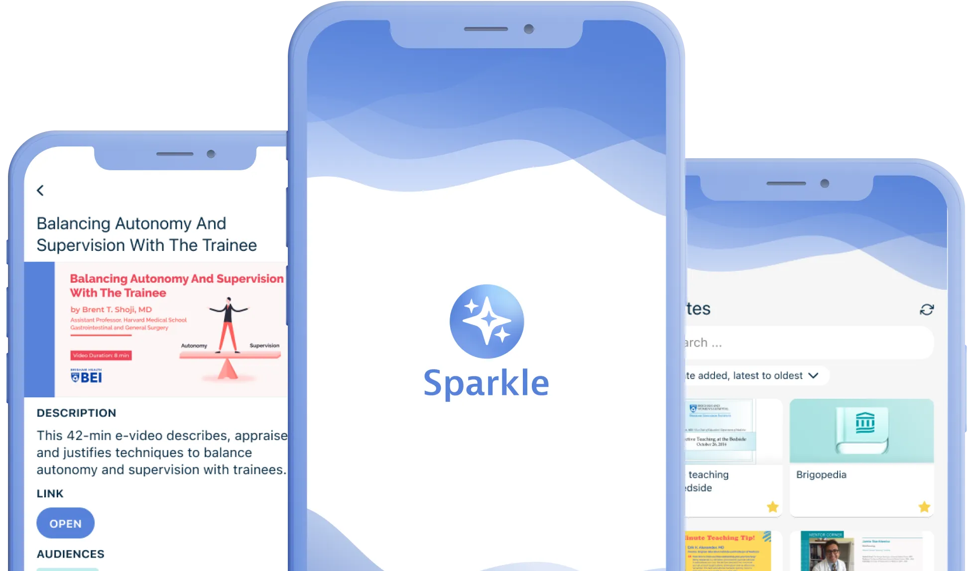
Streamlining Access to Medical Education at the Brigham Education Institute
Providing a single point of entry to information scattered across multiple websites and systems in a medical environment.
Problem Statement
The Brigham Education Institute (BEI) at Brigham and Women's Hospital (BWH) educates medical students and practicing professionals. The institute had a problem with relevant information, such as course curricula and calendars, being scattered across multiple websites and systems. This made it challenging to access this information effectively.
Goal &
my role
Goal - create a mobile app that provided trainees with easy access to all relevant information.
Role - lead product design: conduct user research, provide wireframes and prototypes, and design the app.
- Product design
- User research
- Wireframing
- Prototyping
Team and stakeholders
The core project team consisted of the product owner, a lead developer and myself. Other stakeholders included:
- Department head at BEI (the final decision maker)
- Comms lead at BEI (coordinated some meetings and BEI brand usage)
- Chief resident (rotating position)
- Medical students and residents championing the project
Research &
findings
An important part for me was to get acquainted with the hospital domain both generally and in the specific context of the BWH. There was lots of context-specific terminology, buzzwords, and abbreviations to get a hold of, as well as figuring out how different institutes, hospitals and departments relate to one another.
I conducted semi-structured interviews with a small sample of potential users and relevant stakeholders. Ideally, I would have visited the site and shadowed some of the users, but due to project resource constraints that was not possible. I also included more informal chats with the product owner, who was a resident at BWH and a source of valuable domain expertise throughout the project.
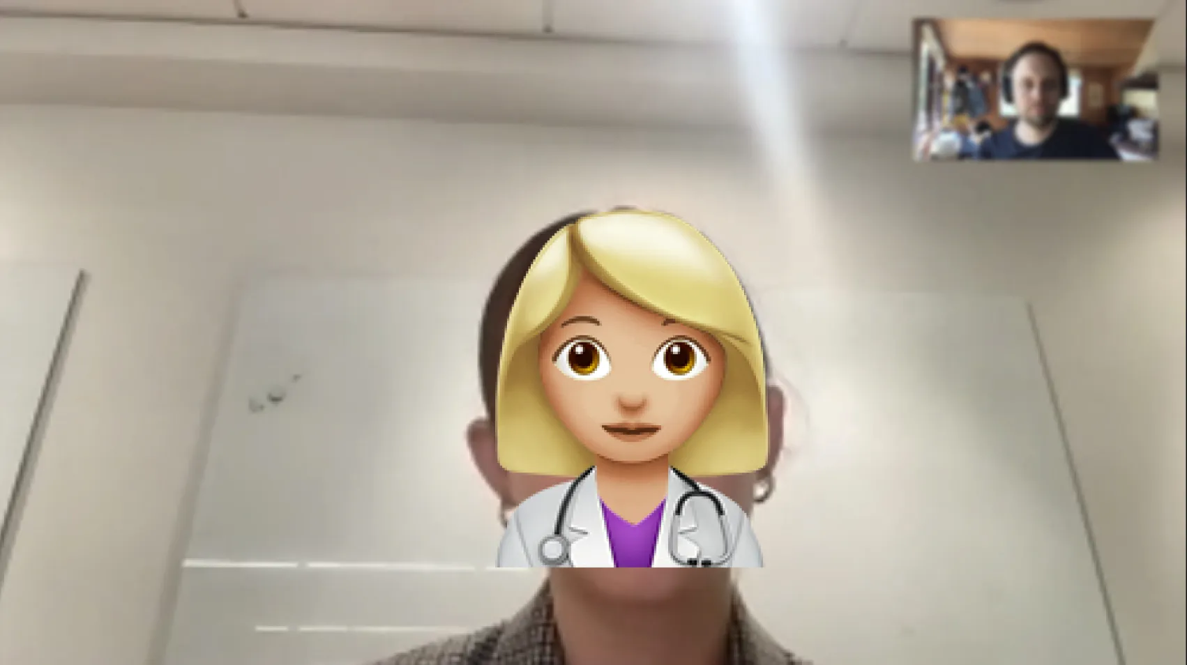
Remote user interview session.
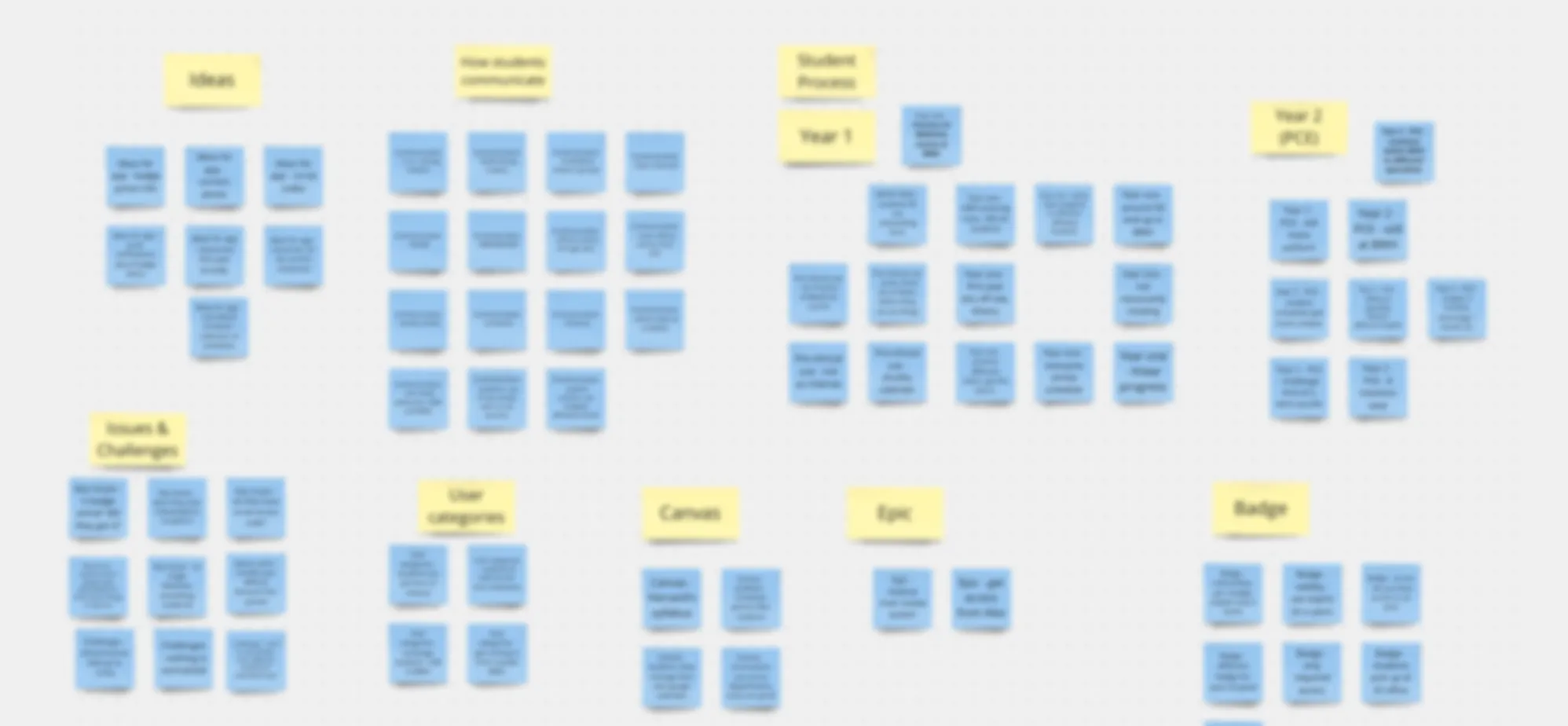
Research notes.
After consolidating the various research data, I arrived at some key insights related to the users, the environment, and the constraints.
Users
Purpose driven
People in the medical field are in called to it to some degree, and draw a sense of purpose from serving people.
Time constraints
Hospital staff is generally under high time pressure, so all users need to be able to access the relevant information quickly and reliably.
Primary users: Residents and fellows
- At the same department for extended periods, very unlikely to change often.
- Deepening knowledge in their field, possibly in directly adjacent fields.
- Main task: finding relevant information quickly.
- Secondary task: tracking their learning progress.
- Device: iPhone
Secondary users: Medical clerkships and interns
- Rotate through various departments every 4-12 weeks.
- Have to acquire a lot of new knowledge constantly.
- Main task: finding relevant information quickly.
- Secondary task: tracking their learning progress.
- Device: iPhone
Product administrators
- Staff members at the BEI.
- Might have clinical roles that overlap with administrative duties, making things busy.
- Limited design and content creation capabilities.
- Main task: Updating content for events through the app backend.
- Device: laptop / desktop computer
Environment
Spotty WiFi - WiFi connection can be spotty in different areas of the hospitals, so the app needs to load quickly and have small package sizes (no huge images, for instance).
Opportunity for differentiation - Many existing resources and systems were built functionality-first, overlooking visuals. This presented an opportunity stand out with better visual design and user experience.
Low-light situations - The hospital features several low-light rooms where limiting screen glare is seen as beneficial.
Constraints
Design guidelines - The BEI and BWH had visual guidelines that we needed to be mindful of, but a strict adherence was not required.
iOS first - The vast majority of the users had iOS devices, so it was decided that the development would focus on iOS for now.
Limited resources - The project itself had a tight budget. In adddition, the department has limited resources for visual content creation such as images or illustrations.
Synthesis
Based on the research findings and problem statement, we clarified guiding design principles for the project:
- Save time and cognitive effort: Recognizing the time pressures of both users and administrators, we prioritize creating user flows that are easy and quick to start and complete, with limited cognitive load. Adding content, finding information, and load times should be fast, and the interface should be kept simple.
- Fit the context: The product needs to reflect the brand of the BEI, respect the seriousness of the subject matter, and to fit in with existing resources.
- Frugality: We are designing for a problem that has been mostly solved elsewhere and we're working with limited resources. We want to develop a robust, low cost and sustainable solution.
Guided by these principles, we clarified what we would tackle in the first version of the app, along with the rationale for the decisions:
- Resource categorization: Collect and organize resources into three main categories (personal collection, department-specific and generally applicable) so that users can easily locate relevant materials.
Why? This addresses the key problem of scattered information and provides efficient access, while allowing us to serve both main user groups effectively. - Clean visual design: I focused on creating a simple, appealing visual identity through cohesive color schemes, typography, and imagery that aligned with the hospital's brand and imagery guidelines.
Why? This would be a cost-effective way to stand out among existing visual materials and offer a degree of familiarity and trustworthiness to users. - Easy maintainability: We would create intuitive and user-friendly systems to manage and add content.
Why? This would empower staff with limited time and design resources to extend the app's content, ensuring its long-term maintainability. - Narrow scope: Some features discussed (such as a customizable and sortable "favorites" area) were moved for later.
Why? The focus of this project was to get an MVP out, so anything that was not required was left out of the scope.
Design process
To get started, I created an information architecture that we iterated on with the team. This helped us reach agreement on the basic structure.
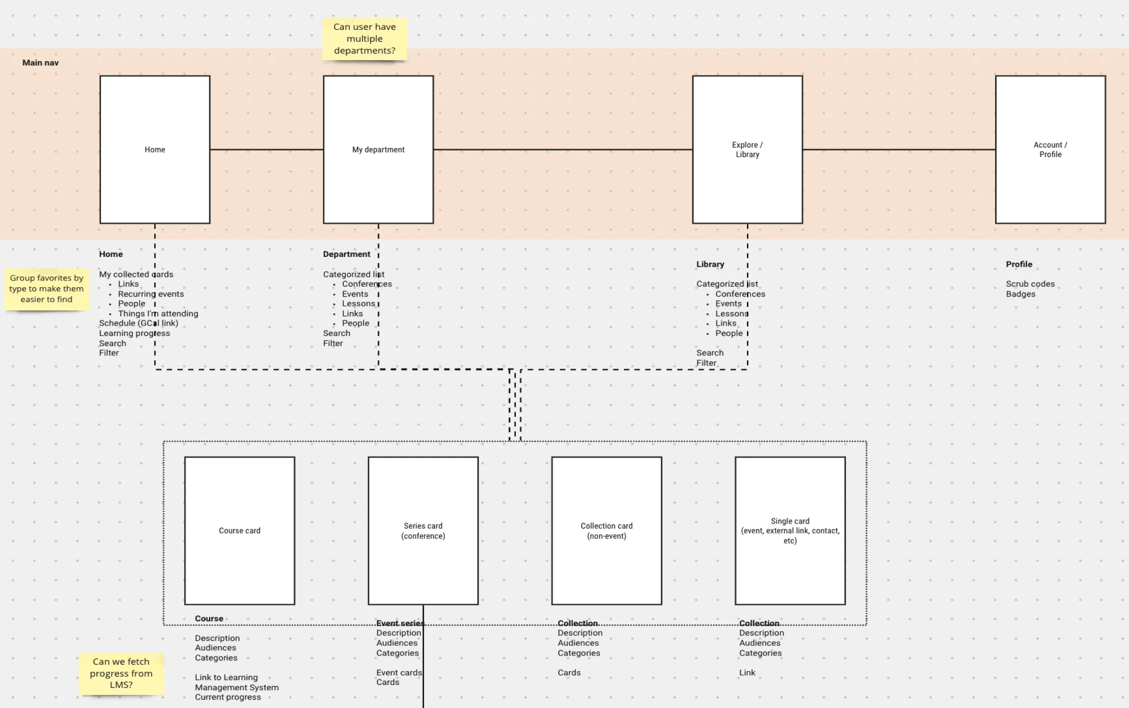
Information architecture work in progress.
I then proceeded to design wireframes, low level designs and Figma prototypes of the views needed to complete the main tasks. Here I worked with the product owner to ensure that all desired features were included, and with the lead developer to ensure that everything was technically feasible. As the domain expert, the product owner was able to evaluate the prototypes to catch any obvious omissions.
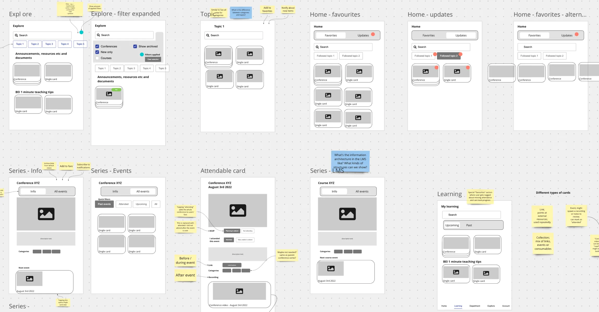
Wireframes in progress.
I refined the initial sketches into polished designs and collaborated closely with the lead developer to build an MVP for beta testing. The MVP was then released for a limited TestFlight trial with select hospital staff in a single department. This allowed us to start gathering feedback on bugs on a regular basis.
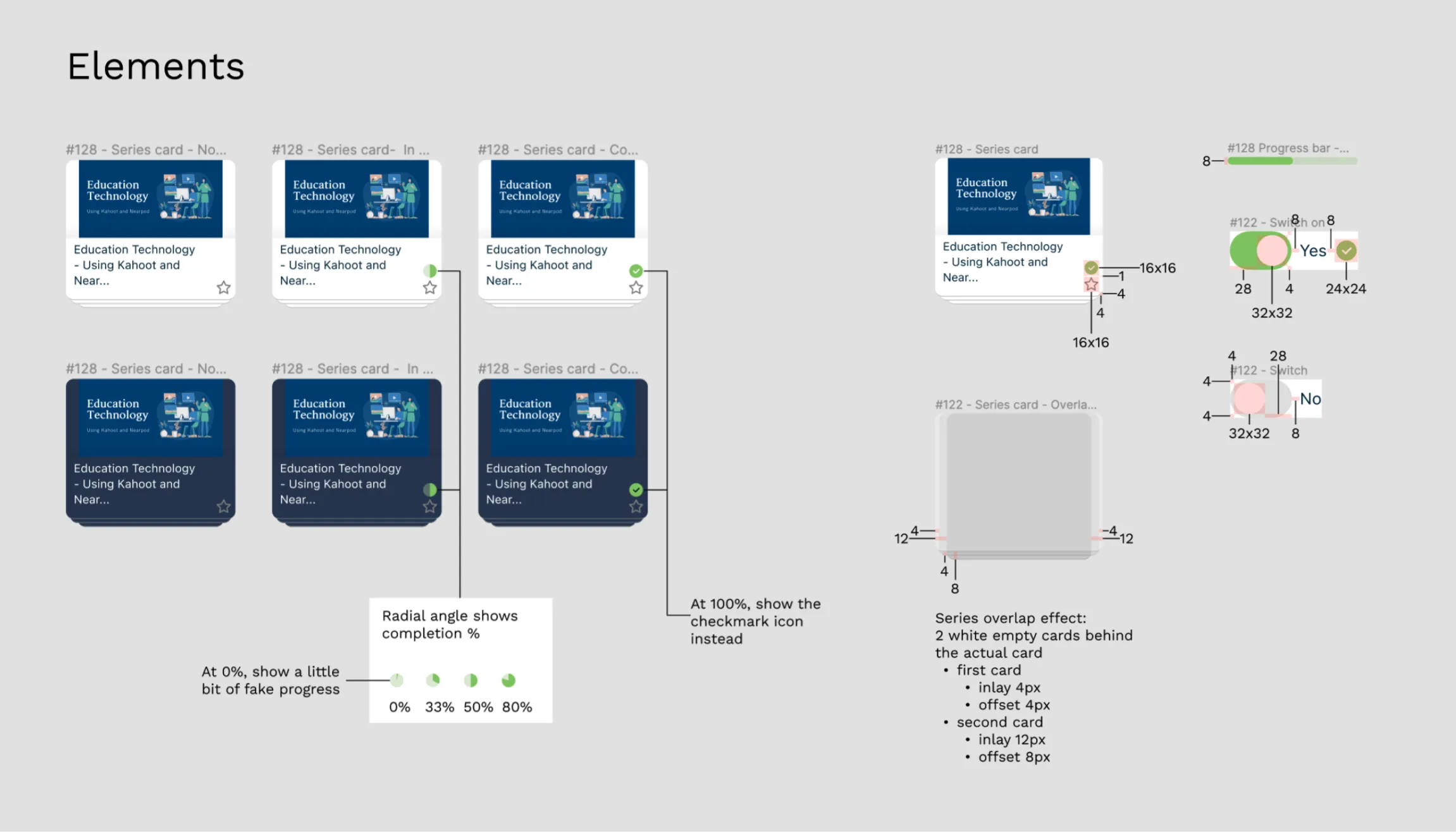
Excerpt of handoff notes.
By actively seeking and implementing user feedback, we were able to continuously improve the app and make further refinements based on their suggestions.
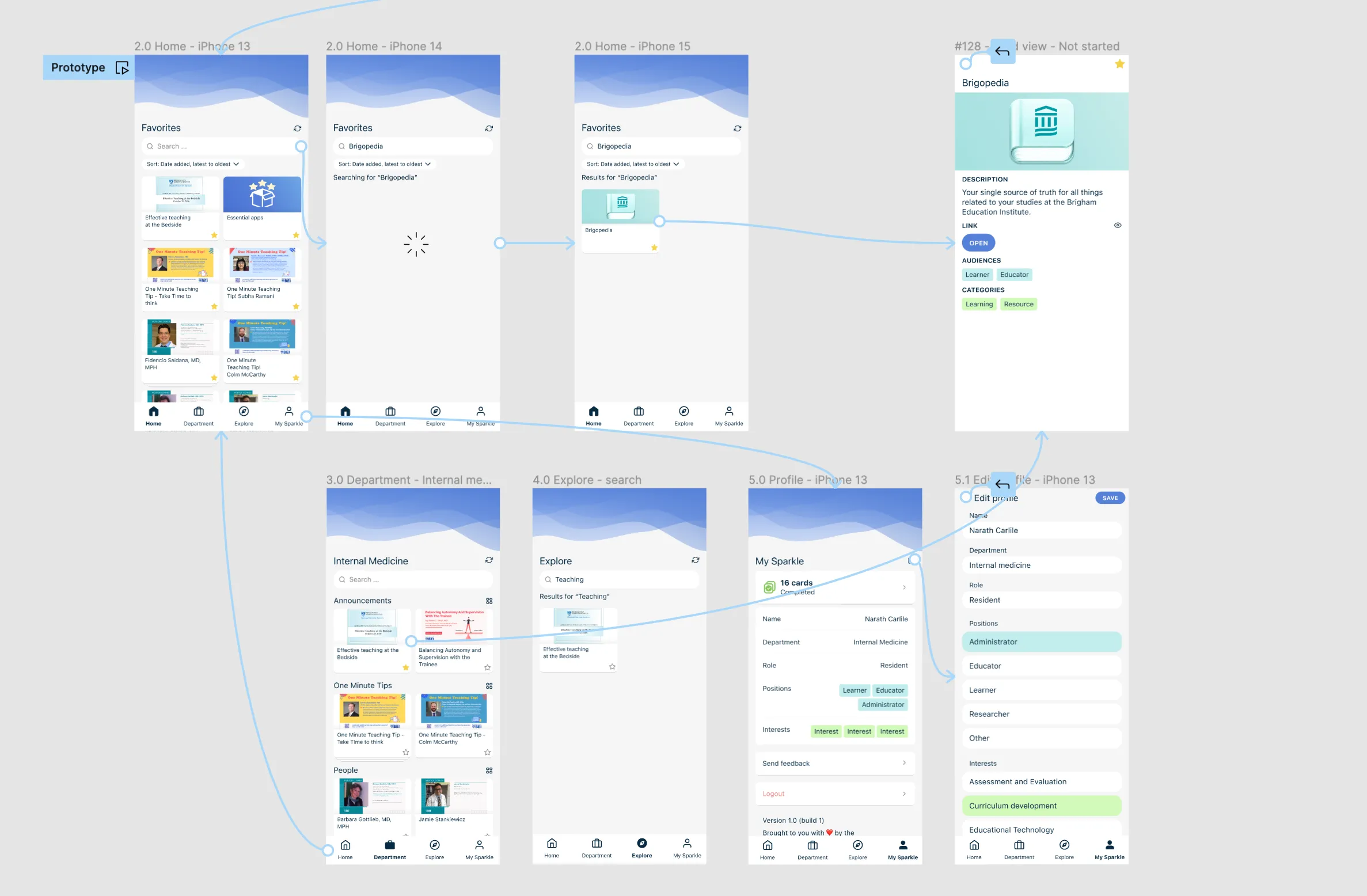
Prototype schematic.
Solution highlights
Eventually, we developed a robust MVP of the app that fulfilled the key requirements and was released within a few departments first.
Easy access to relevant resources
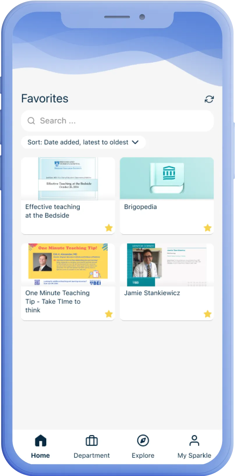
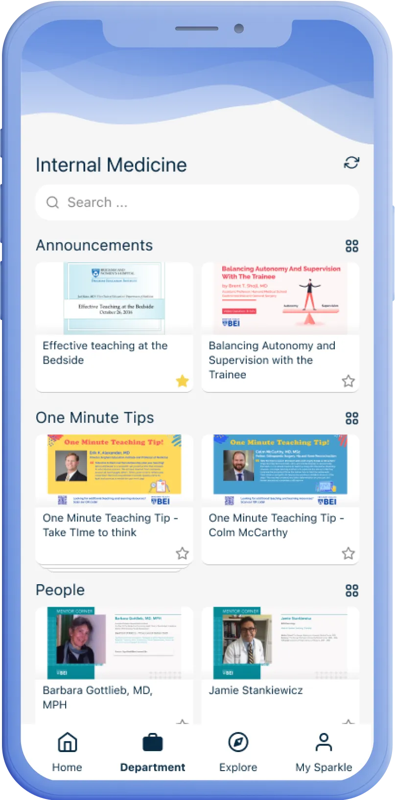
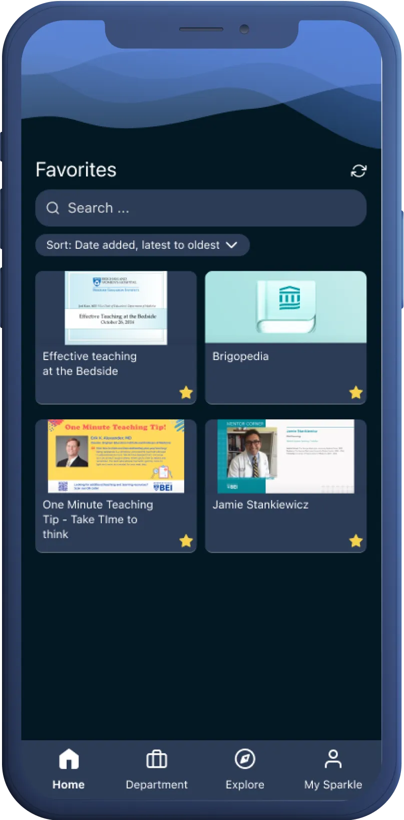
Dedicated, top-level views provide users with easy access to their favorite and department-specific resources, achieving the main goal of the project.
Congruent, respectful design
I developed an appealing design that complemented the available resource imagery and hospital brands, both in light and dark modes. The design of the app successfully and favorably distinguished it from other resources within the hospital context.
Easier learning journey tracking
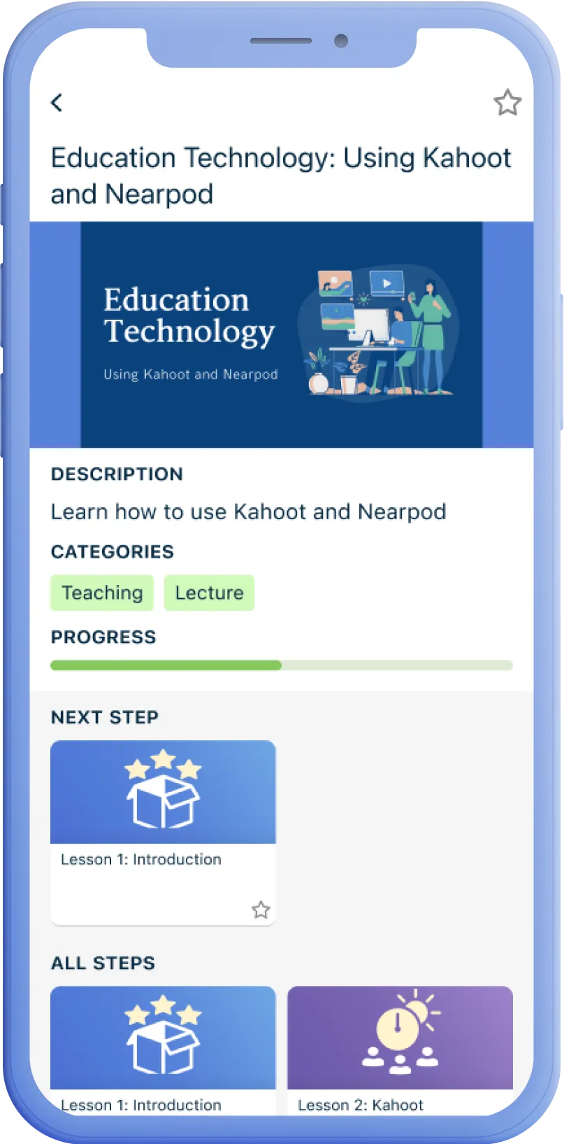
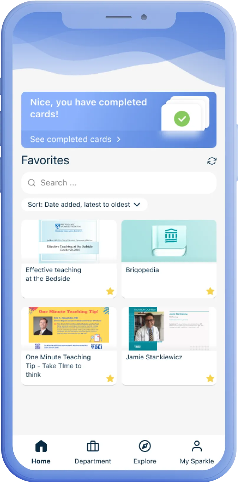
Users have the ability to track their learning progress through the app. This allows them prioritize relevant resources and provides opportunity for delightful celebratory mini-experiences along their learning journey.
Additional output
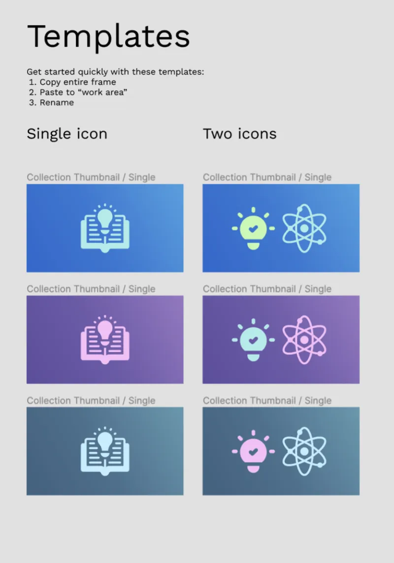
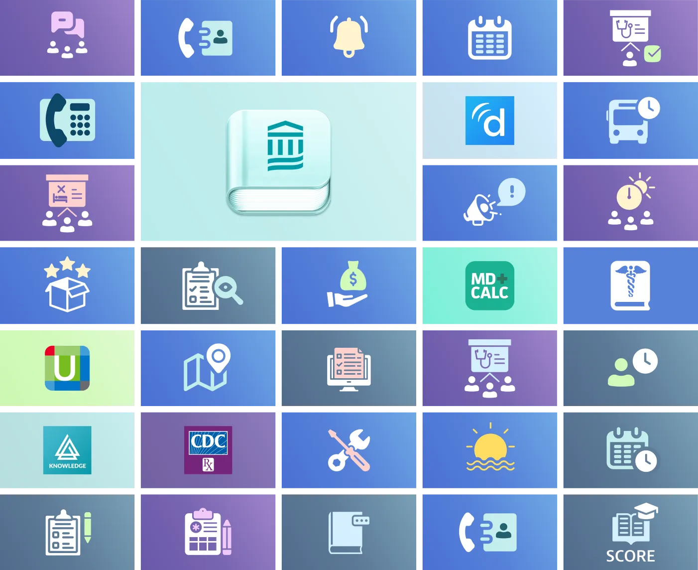
As part of the work for the app visuals, I created a cohesive visual language for the card thumbnails and a simple Figma-based generator for hospital staff to easily make new ones. This empowers the staff to create new icons easily.
Outcome
Improved access to relevant resources
The system received positive feedback from both users and administrative staff. Users, specifically the BEI's students and residents, expressed satisfaction with easy access to relevant resources and the app's user-friendly and engaging experience. Additionally, the administrative staff lauded the ease of content management.
Promising adoption rates
The initial release of the app was a success, with 85% of potential users incorporating it into their daily workflow. This indicates that the app is on the right track to addressed the needs of residents and students at the BEI.
Further developments
Other departments and hospitals within the larger organisation have expressed interest in adopting the app, and an Android version is planned to expand service coverage.
Takeaways
1 - Importance of understanding domain expertise
This case highlighted the importance of understanding the highly specialized domain to address user and stakeholder needs well. It's important to do your background work but also continually ask clarifying questions to ensure a good understanding of the jargon and concepts.
2 - Leverage the context to stand out effectively
In this case we were able to create an effective, well-received design even with low resources by being strategic on where to invest more effort and where we can make do with less.