Transforming an internal tool into a B2C/B2B product at Timespace
Timespace needed to improve the user experience of their in-house project management tool to help bring it to market.
Problem statement
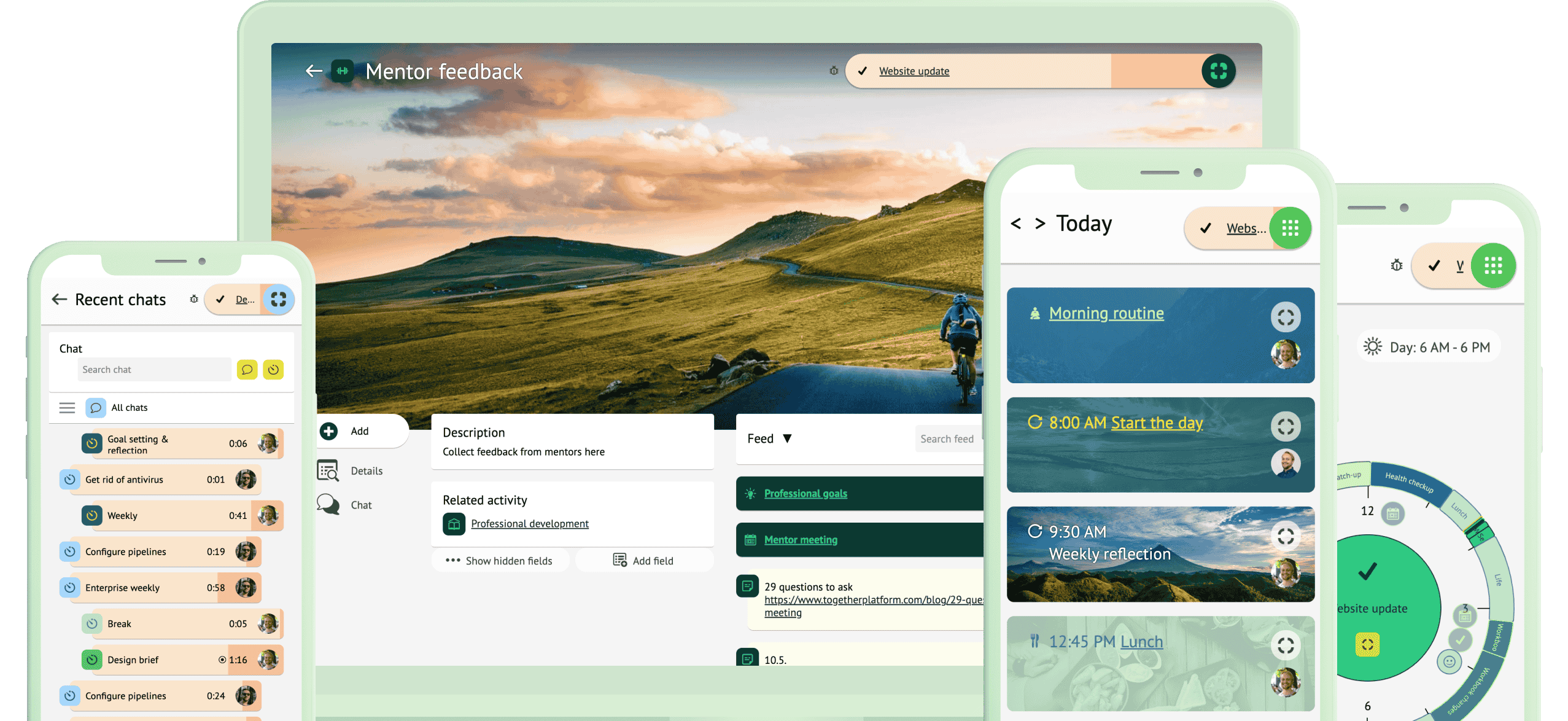
Timespace used a multi-feature web and phone app that was developed in-house for project management and collaboration. The tool consolidates notes, emails, files, photos, time tracking, reports, and in-app messaging to make them easily accessible based on topic or project.
The goal of this project was to transform Focus from a functionality-focused in-house business tool to a more user-friendly B2C/B2B product, without sacrificing its usefulness for existing power users.
Goal & my role
As the lead designer, I was tasked with redesigning the app's onboarding and views throughout to make the app more user-friendly and maintainable.
I was closely involved in every aspect of the product development process, from ideation to research, product design, and continuous development. I also participated in front end development.
- Product design
- User research
- Wireframing
- Prototyping
- Front end development
Research & user needs
I interviewed existing power users to find out important features for them. To get some fresh perspectives on the problem space, I also conducted desk research on competing products and online communities centred around task management and productivity.
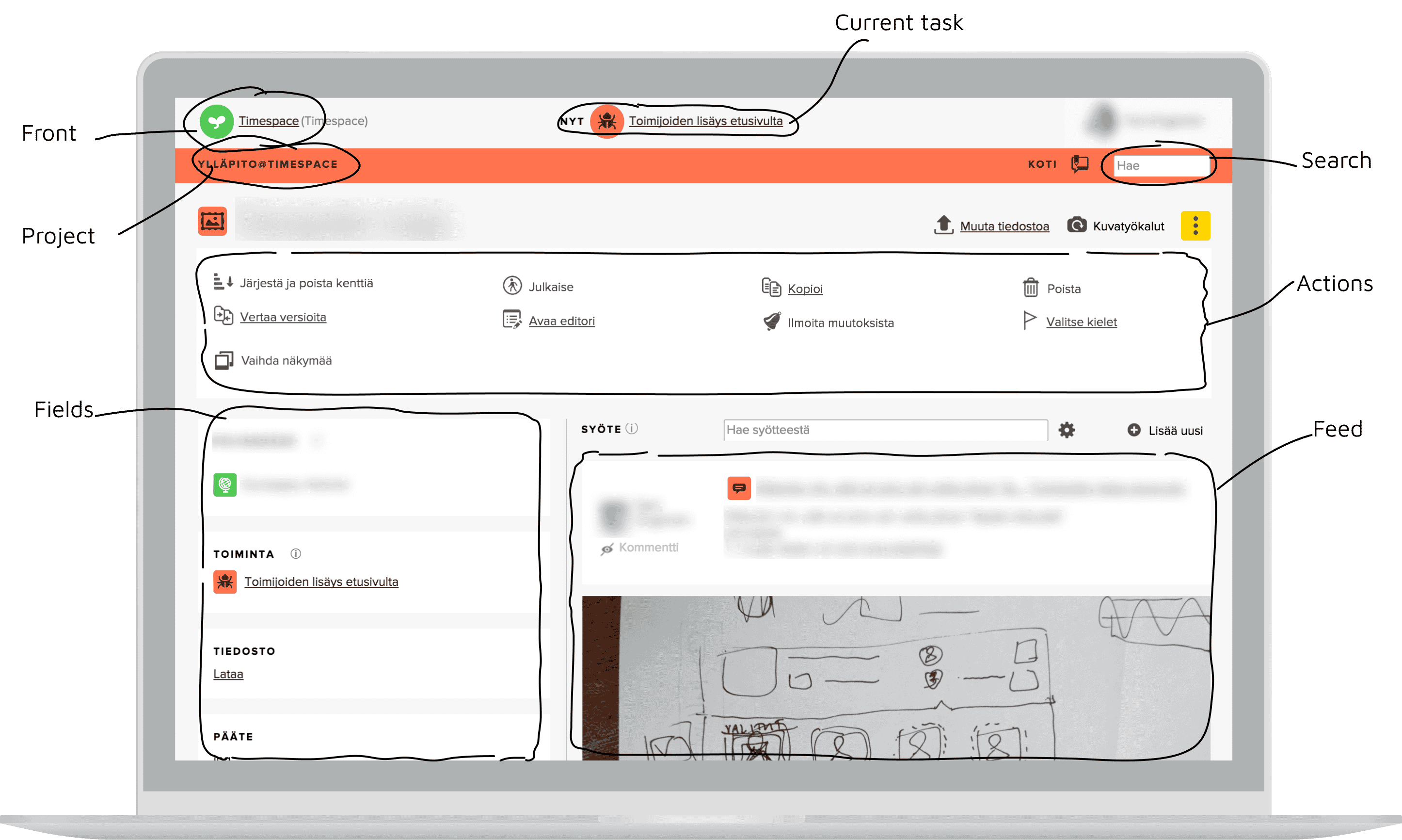
Annotating the previous version of the app.
Based on the research findings, I synthesized six main user needs:
Concise task overview: users prefer a clear and concise view of relevant tasks and priorities to efficiently plan and manage their time on a daily, weekly and long term basis. Less relevant items should be hidden but still easily accessible.
Enhanced focus: users seek tools and features that facilitate concentration, minimize distractions, and promote deep work by providing a conducive environment for focused and uninterrupted productivity.
Quick, cross-platform access to resources: users require a centralized platform, accessible via any of their devices, where they can store, organize, and access all content, including notes, emails, files, photos, and messages, to avoid information fragmentation and ensure a comprehensive and unified workspace.
Effective collaboration: users seek intuitive and integrated collaboration features, including in-app messaging, file sharing, and communication tools, to facilitate synchronous and asynchronous collaboration with team members without causing unnecessary disruptions.
Personalization: users need visual cues or categorization methods to easily distinguish and switch between different projects or tasks, enabling efficient task management and prioritization.
Easier time analytics: users struggle with manual input of time tracking data and desire features that provide insights into their time allocation. They want to know how they spend their time to identify areas for optimization and productivity improvement.
Constraints
Because the app was already live with a considerable code base, there were a number of constraints in place. Firstly, the development team was small so rewriting large swaths of code was not possible. Secondly, the app was using a WebView-based system that allowed us to use mostly the same code base for all platforms, but many device-specific native designs were not feasible. Thirdly, because it was a live app, we had to ensure our changes were backwards compatible - at least to a degree that suited the current users.
Solution highlights
I created a robust design system that was extendable with limited design oversight and easy to implement with web technologies. The cross-platform design allows users to seamlessly access and utilize the app on their preferred devices, maximizing convenience and reach.
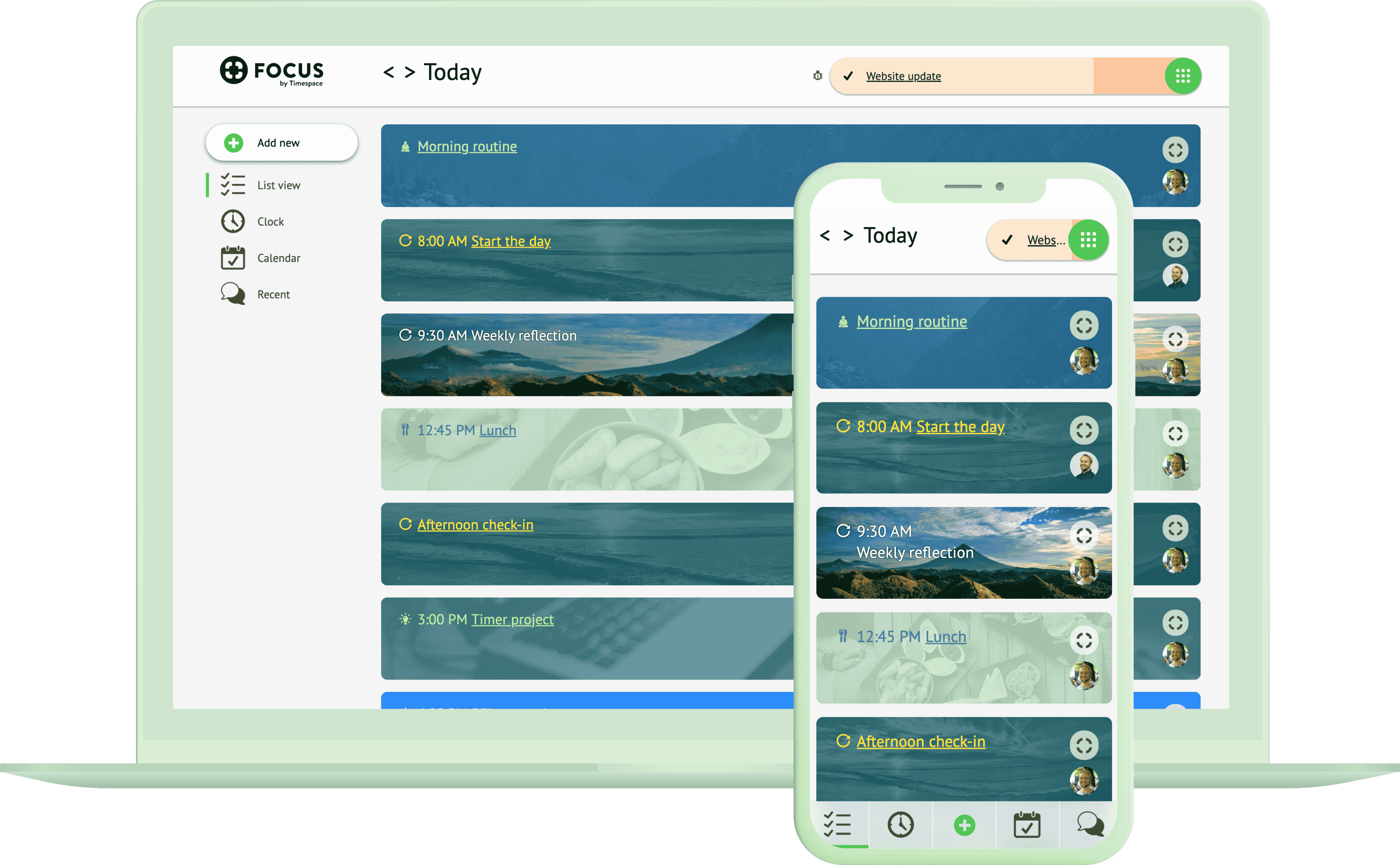
Front page view of a users' upcoming tasks on desktop and mobile.
Task list
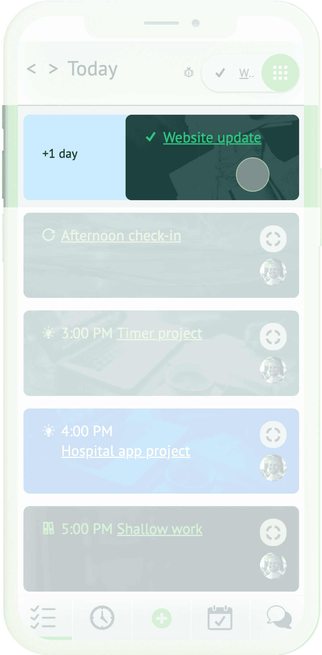
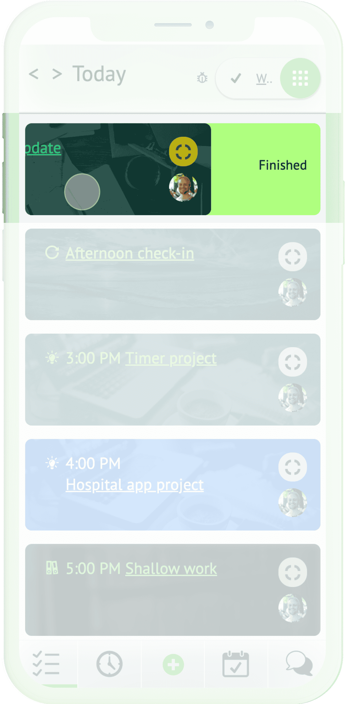
This view lists a day's tasks and other relevant activities in priority order to provide users with a concise overview of tasks.
To remove irrelevant items from view, users can easily finish or postpone items by swiping them left or right.
Focus mode
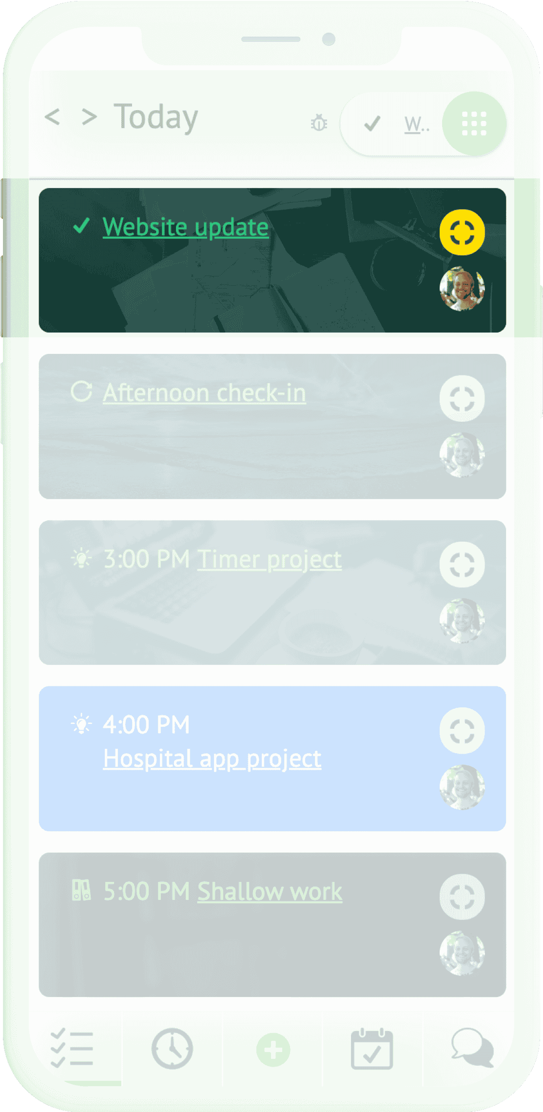
By activating Focus mode on a task or activity, users immerse themselves in a task-specific context within the app. This enables app-wide easy access to relevant information.
In teams, focus mode effectively broadcasts user status and progress, reducing unnecessary interruptions and fostering uninterrupted productivity.
Context-specific feeds and chats
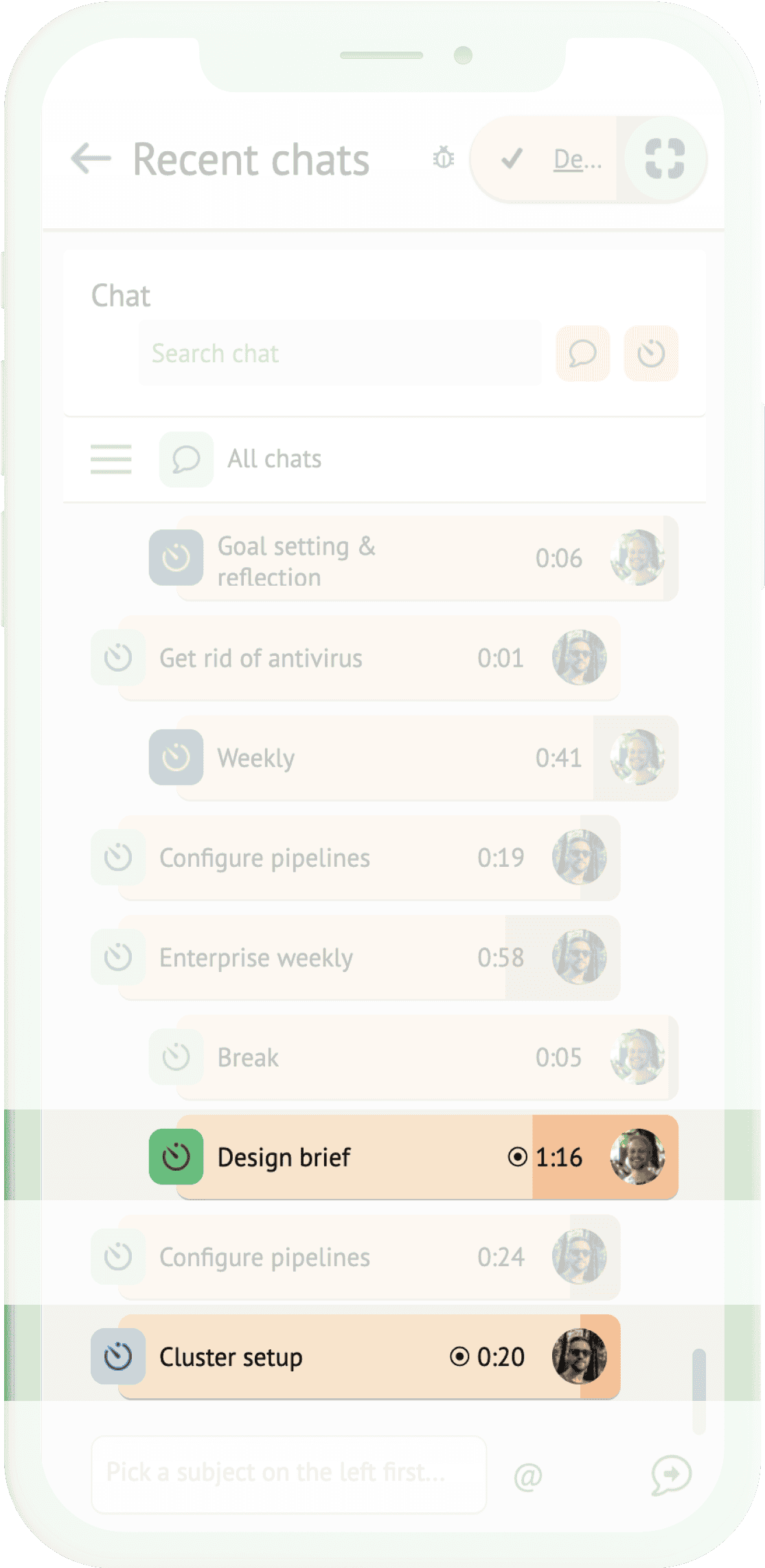
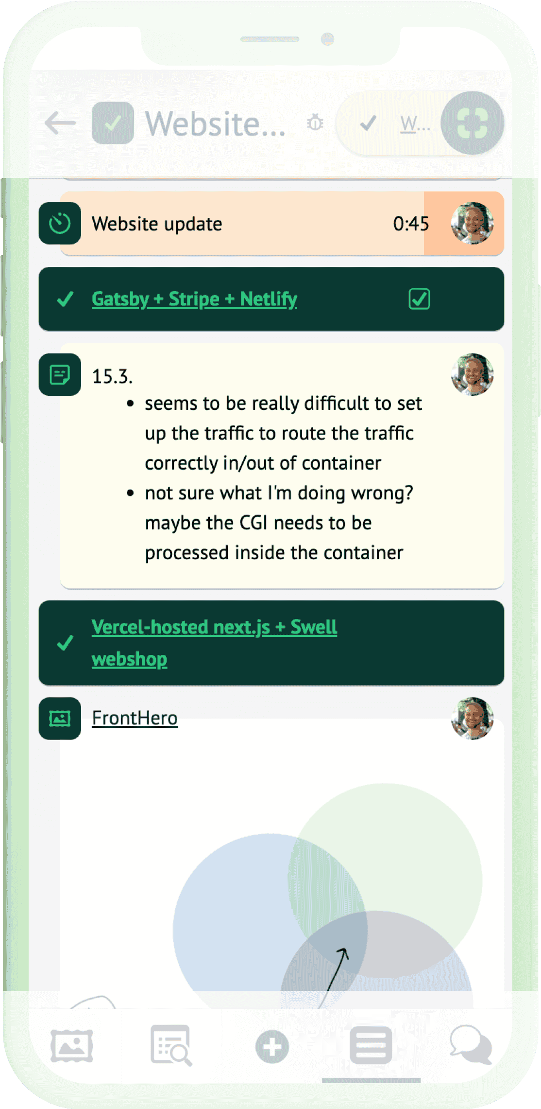
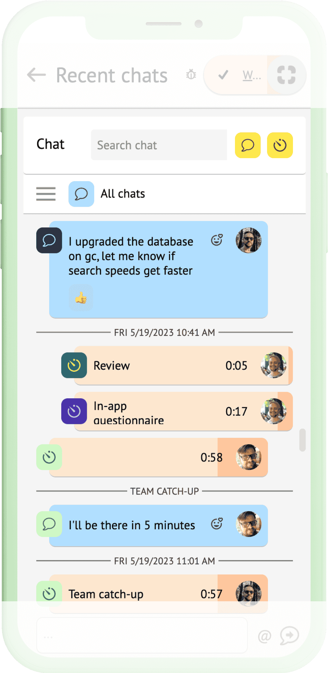
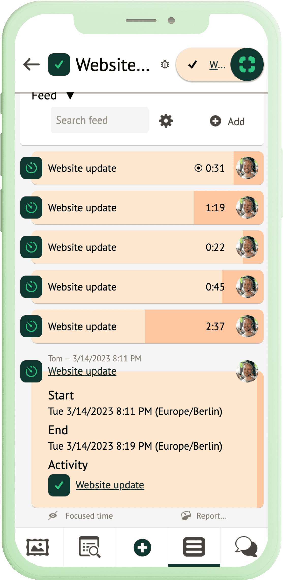
A feed-based, searchable resource management system within the app allows users to access, store and organize relevant resources and communications such as files, images, emails, notes and contact requests. This provides easy access to context-specific resources and eliminates information fragmentation.
Color- and image-coded personalization
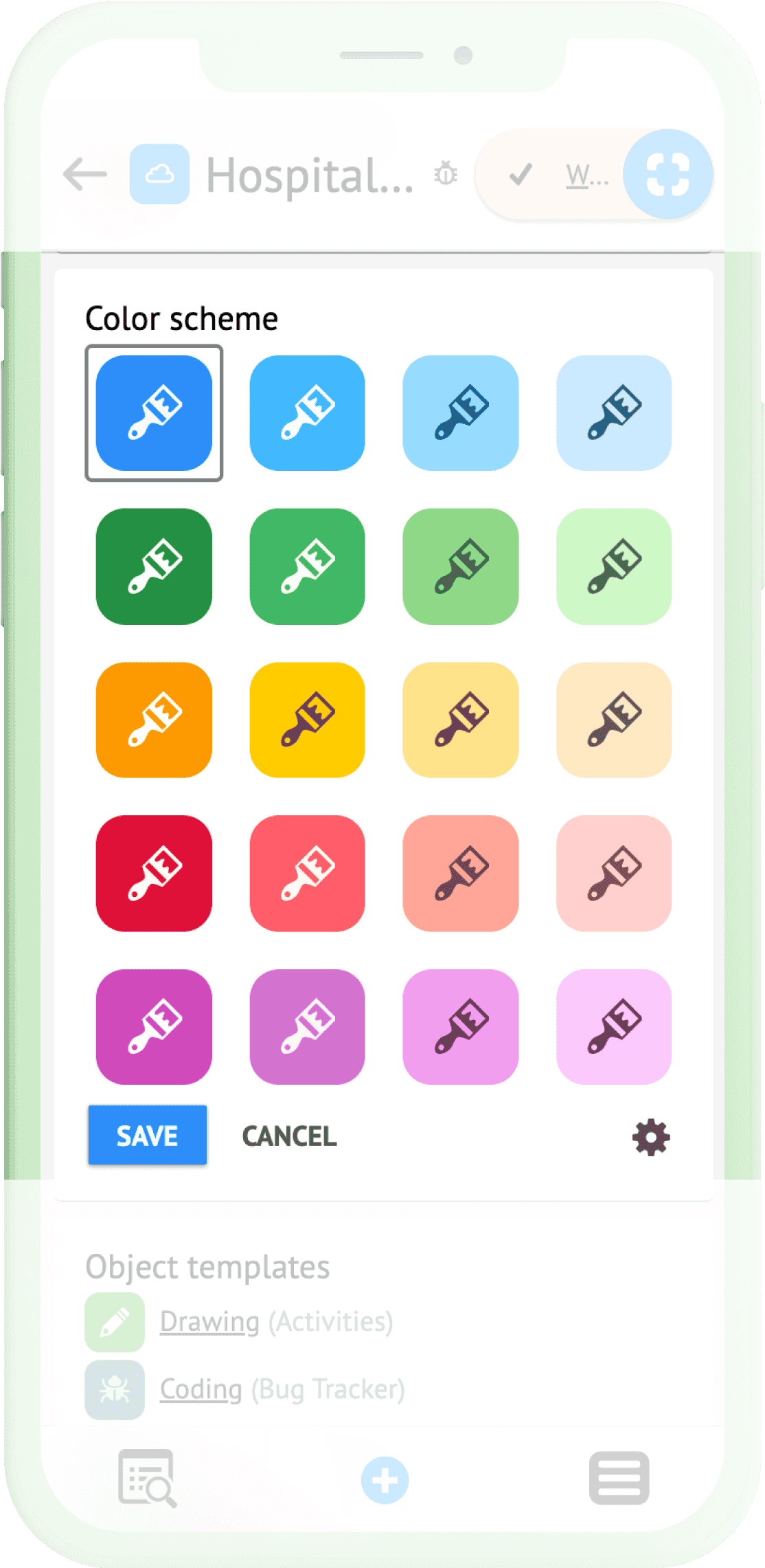
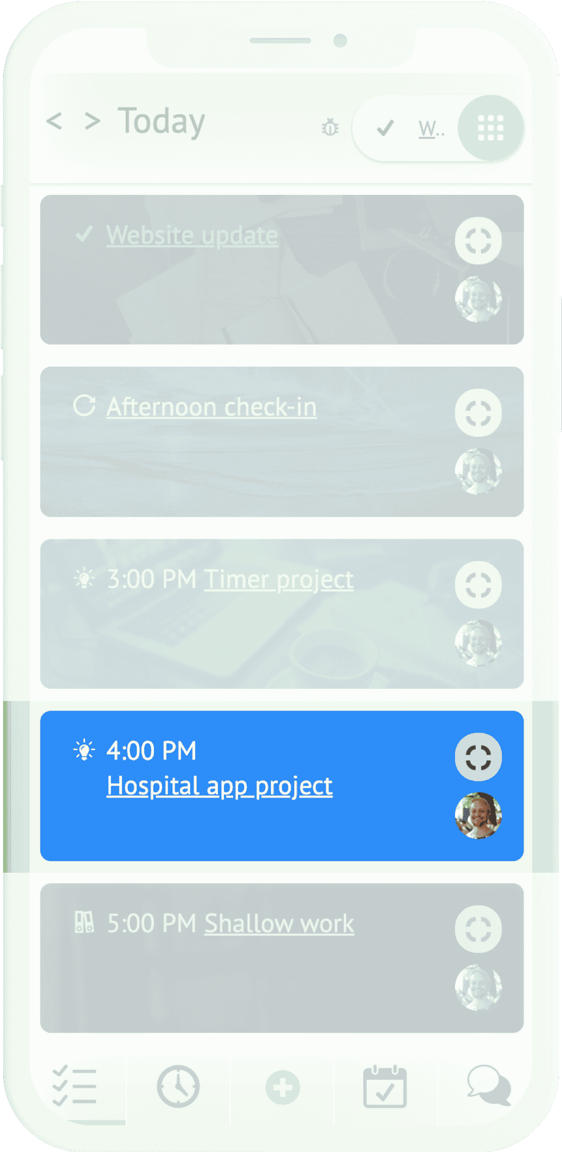
Users can easily assign preset or custom colors and cover images to individual projects or tasks, making it easier to identify and switch between different projects or tasks within the app. This also serves to make the app experience more visually appealing.
Automatic time tracking and visualization
Baked into Focus mode is built-in time tracking that automatically records the time spent on tasks, replacing the earlier need to input times into fields manually.
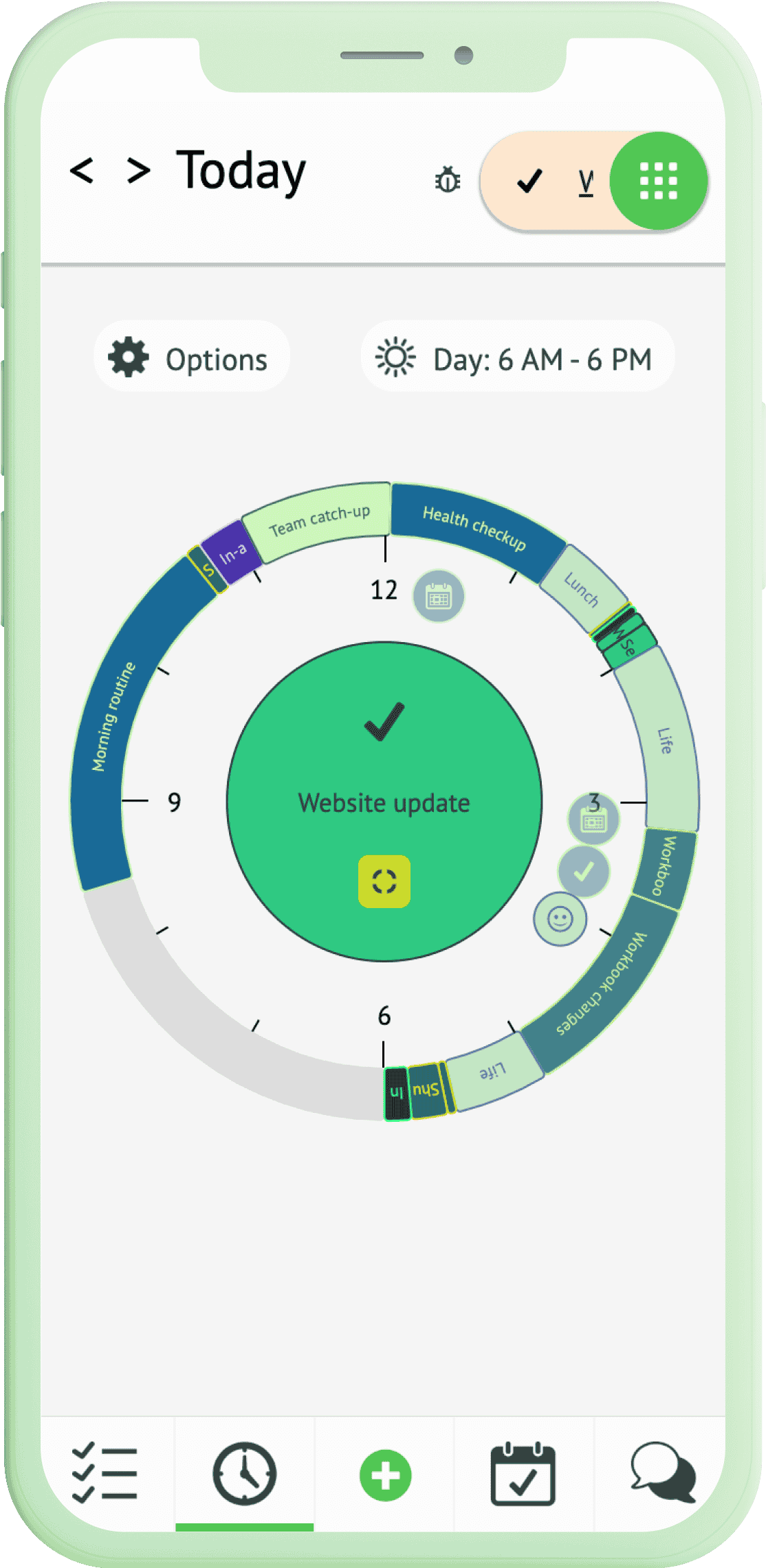
Data visualizations and tables provide users with detailed insights into their time allocation and help identify areas for productivity improvement.
Outcome
1 - Improved user experience
The changes resulted in improved understanding of key concepts for new users and a smoother user experience for power users.
2 - Enhanced design system and improved maintainability
The new design system and new layout engine ensured maintainability with minimal designer involvement.
